If you’re new to trading or have a pile of cash you want to put into the market, then you’ll have a different approach to someone who was already ‘all-in’. Short term corrections can turn out to be excellent buying opportunities for those with spare capital to invest. Investors who have already fully allocated their money could consider cutting some positions in the hope of buying back at a lower price. Whatever your starting point, these are the technical analysis indicators and metrics to use to monitor momentum and help you try to hold your nerve during a stock market sell off.
How to Spot When A Market Is About To Crash
The first quarter of 2022 offers an ideal case study of a market due for a correction. Starting at the beginning and understanding why a market crash occurred can offer clues on how to react when prices start falling.
Using Relative Strength Index (RSI) to Spot a market crash
The Relative Strength Index (RSI) is an oscillator-style technical indicator, which processes market price data through the below formula:
Relative Strength Index = 100 – [ 100 / 1 + (Average Gain / Average Loss)].
Fortunately, this list of highly regarded brokers includes firms that do the legwork for their clients and provide an easy-to-use RSI indicator as part of their offering. The conventional approach is to consider markets with an RSI value of below 30 to be ‘oversold’ and RSI values greater than 70 as a sign that a market is ‘overbought’.
Points A and B on the below FTSE 100 price chart pinpoint moments when the RSI reached 70, times when the market was seen as ‘overbought’, and price did subsequently fall.
FTSE 100 – Daily Candlestick Price Chart – August 2021 – March 2022 – Oversold RSI predicts a market sell-off
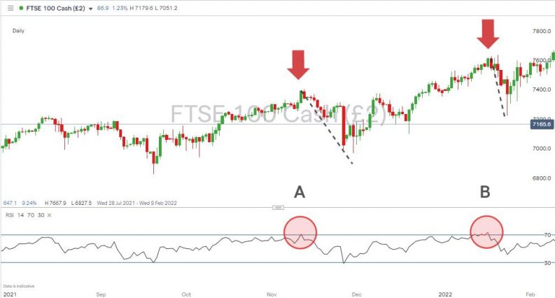
Source: IG
If a market sell-off coincides with the RSI being >70, then the change in direction can be interpreted as part of ‘normal’ market activity. That doesn’t help investors watching their long positions lose money, but it explains the process as part of the continuous balancing of greed and fear among investors.
Using Money Flow Index (MFI) to Spot a market crash
The Money Flow Index operates similarly to RSI but incorporates trade volume data as well as price data. It works on the basis that a price move that is associated with higher trade volumes is more significant than one that occurs on a quiet trading day. If the big players in the market, on both the bullish and bearish sides, engage in a greater amount of trading, then the resulting outcome is a sign that one side of the argument has lost, at least for a while.
The formula for the Money Flow Index oscillator is detailed below, and again good brokers offer it as a ‘click of a button’ tool to their clients. The metric ranges from 0 – 100, and in this case, the conventional approach is to consider a reading of 20 as a sign of a market being oversold and 80 of it being overbought.
- Calculate the typical price for a period – Typical Price = (Low + High + Close) / 3
- Calculate the raw money flow – Raw Money Flow = Volume x Typical Price
- Calculate the money ratio – Money Ratio = 14-period Positive Money Flow / 14-period Negative Money Flow
- Calculate the Money Flow Index (MFI) – Money Flow Index (MFI) = 100 – [100 / (1 + Money Ratio)]
FTSE 100 – Daily Candlestick Price Chart – August 2021 – March 2022 – MFI predicts a market sell-off
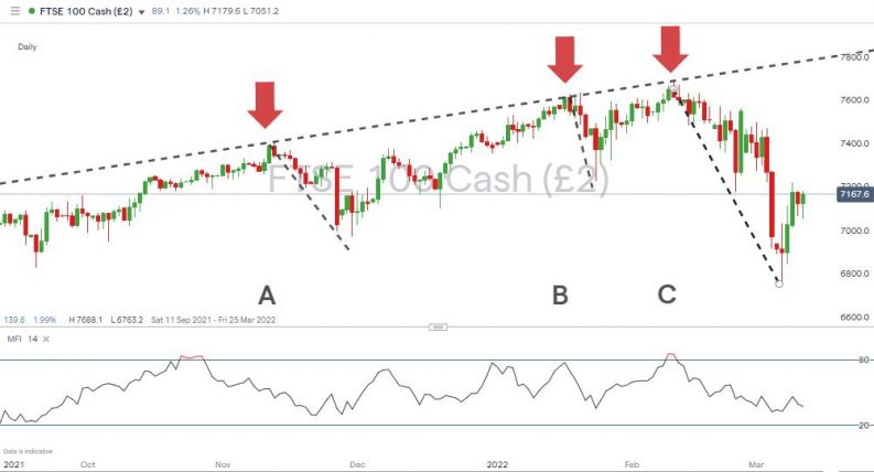
Source: IG
In the case of the above FTSE 100 chart, the breach of the 80 MFI level was soon followed by a sell-off, and in the case of arrow C, there was an 11.61% fall in the value of the index over just 26 days.
Using Trendline Strategies to Spot a market crash
The correction in the FTSE 100 index, which was anticipated by the MFI, corresponded with a break of a multi-month supporting trend line. The line complied with the textbook definition of trendline strategies and had bounced off the supporting line on at least three occasions.
FTSE 100 – Daily Price Chart – March 2021 – March 2022 – Break of supporting trendline
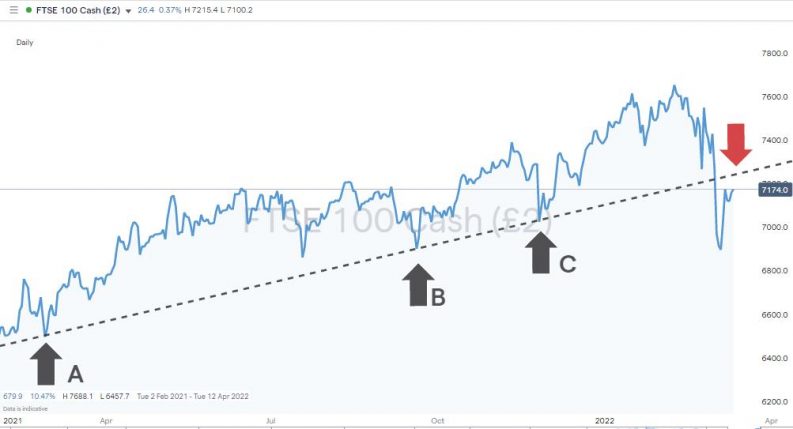
Source: IG
Exponents of technical analysis will point to news events being used to explain market corrections, which were arguably already imminent due to markets being already technically overbought.
The events of March 2020 provide one example. At that time, the S&P 500 index fell 34.9% in less than one month as the COVID pandemic brought the global economy to a grinding halt. The RSI reading for that index on a daily price chart shows RSI printing at 73.4 on 10th February 2022, just two days before one of the largest market sell-offs in history took place.
S&P 500 – Daily Price Chart – May 2017 – March 2022 – RSI & Covid
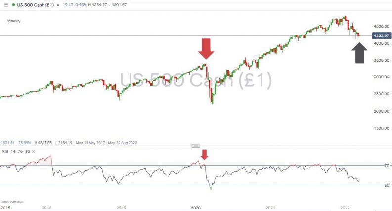
Source: IG
Used in isolation, these indicators are not 100% reliable, and it is recommended to apply them in conjunction with other metrics. The S&P 500 index price chart, for example, records several moments in 2021 where the RSI printed higher than 70, but price just kept on going higher. For traders who wake up one morning to find their portfolio has made significant losses overnight, they can offer an insight into the nature of the sell-off and whether the move is one to ride out or sell into.
What to Do When Markets Crash
Understanding the technical analysis-based reasons behind a market sell-off is one thing; effectively trading it is another. An investor’s reaction will be determined by whether they are looking to manage existing positions, buy the dip, or sell-short to make a profit from the fall. Whatever the approach, some methods and techniques can be used to understand the nature of market momentum.
It is worth noting that equity market price crashes operate in a way that is different to when they rise. Most equity indices are associated with prolonged periods of steady price increases – the long-term trend being upwards. On the other hand, stock market crashes tend to be much more sudden in nature.
If you’re new to trading and have built up your trading skills using particular tools to trade a steady bull run in relatively low volatility, then the signals they offer in a downwards market may be different due to the speed of the sell-off. It’s not just a case of them pointing downwards but being more extreme in appearance.
Using Heiken-Ashi Candles to Monitor Market Momentum
Heiken-Ashi candles offer a graphic representation of the strength behind a market trend. Adapted from traditional candlestick charts, Heiken-Ashi candles use the same price data but illustrate it in a way that offers clues as to whether a trend is continuing or losing momentum. This research article considers Heiken Ashi candles and their pros and cons in more detail. It also provides a case study of the strategy being implemented.
S&P 500 – Daily Price Chart – Sep 2021 – March 2022 – Heiken-Ashi Candlesticks
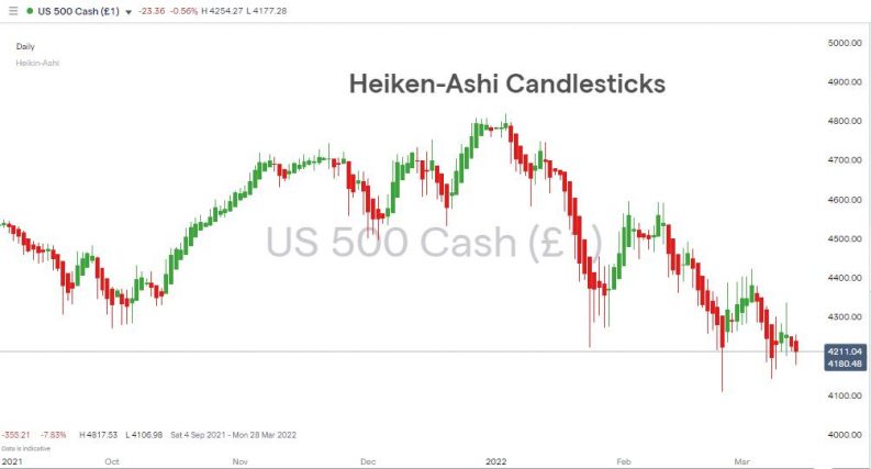
Source: IG
Momentum Trading Strategies That Incorporate Trading Volumes Data
Price data is the primary building block of technical analysis but incorporating trade volume data into your analysis can help traders spot how well supported is any price move – the more significant the increase in trading volumes, the greater the move’s momentum.
If trading volumes increase during a trading session, then it means a larger than average number of market participants have joined in the ‘debate’ on which way price should go. The conclusion is a stronger one than if trading volumes had been lower.
Using Candlestick Patterns to Monitor Market Momentum
A ‘ capitulation candle ‘ is another technical indicator to look out for when trading momentum strategies. If found during a market sell-off, this candle gives a graphic illustration of a market about to turn. It represents a trading session where price trades in a wider average range, including a relatively large swing to the downside, which then recovers to close near the high of the daily trading range.
Different candlestick shapes tell different stories about market momentum, and fans of the subject go into extensive detail about how Doji, Tombstone and Hammer candlestick patterns can be used to establish the nature of a sell-off.
How to Spot the Bottom of a Market Crash
Fundamental analysis provides an obvious backdrop to any market sell-off. Whether it’s the actions of OPEC, announcements relating to COVID vaccines, or news on other geopolitical events, reports on any of these news topics can bring about a change in market direction. Technical analysis can also help identify precisely when that change might take place.
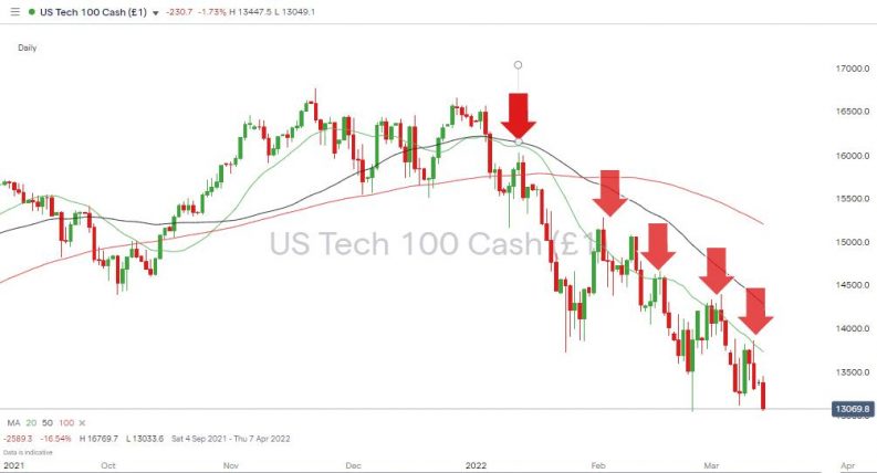
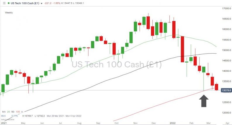
Using Simple Moving Averages (SMAs) to Spot the Bottom of the Market
Simple Moving Averages iron out the price action of a market by taking the mean average price over several previous trading sessions. The number of sessions can be set according to each trader’s personal preference, but popular ranges, which many other market participants will be using, are 20, 50 and 100.
Nasdaq 100 – Daily Price Chart – Sep 2021 – March 2022 – Simple Moving Averages
Source: IG
During the sell-off in the Nasdaq 100 index during Q1 of 2022, price repeatedly bounced but failed to break above the 20 SMA on the Daily price chart. Instead, the 20 SMA tracked the slide in prices. For those looking for the moment that the market turns, then a sustained move above the 20 SMA would be seen as a bullish indicator.
Another way SMAs can help determine when a market is about to turn is the support they give to price. Analysing the Nasdaq 100 index using the Weekly price chart shows the Weekly 100 SMA provided support to price levels. The bounce marked by the black arrow marks a point when buyers stepped into the market with an ‘enough is enough’ attitude. They were ultimately undone by continued price weakness, and while the signal didn’t lead to a confirmed reversal, there was enough of a bounce for some profits to have been locked in.
Nasdaq 100 – Weekly Price Chart – Sep 2021 – March 2022 – Simple Moving Averages
Source: IG
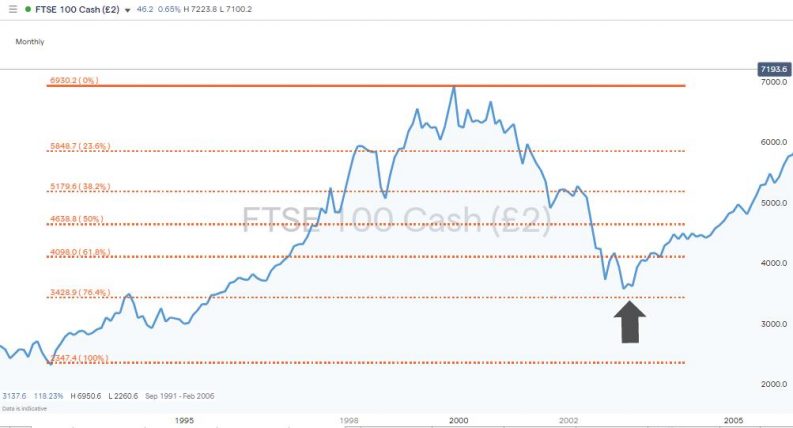
How to Use Fibonacci Trading Strategies to Spot a Market Reversal
Fibonacci retracements are another tool to identify support levels in a falling market. This report outlines how to build strategies that use Fibonacci levels, which have an uncanny habit of marking the bottom of a market, such as the Dot-Com crash.
FTSE 100 – Monthly Price Chart – 1991 –2005 – Fibonacci Retracements applied to Dot-Com crash
Averaging into Positions
All trends eventually reverse, and in the case of market crashes, the recovery can be particularly dramatic. As a result, traders looking to buy the dip will work into positions incrementally. The aim is to capture some of the rebound even if price doesn’t reach the lowest of the possible trade entry points.
In the above price chart, price didn’t quite reach the 76.8% Fib retracement, but those who bought in at the 50% and 61.8% levels would have still made a positive return on their trades if they’d held them long enough.
Those potential trade entry points can be based on news events, particularly if the crash was caused by headline-grabbing geopolitical events or a problem such as the COVID pandemic. But there are plenty of other metrics based on technical analysis, which can be used to predict support levels at which price might turn.
Final Thoughts
Those looking to trade a falling market would do well to consider if momentum is showing signs of turning. That will determine if the better option is to trade with the downward trend or start looking to buy the dip. Some caution is required as false signals can be generated, and trading crashing equity markets can be an intense experience.
An approach sometimes used is to wait until a reversal has been confirmed before entering into a position and scaling out of it before that trend ends. The adage that investors should join the party late and leave it early is applicable.
Whether you’re buying or selling a market crash, one of the most important decisions to make is the broker you choose to use. Navigate to the AskTraders list of trusted brokers to find CFD trading platforms that have been reviewed and checked for their trustworthiness. Part of that review includes testing the range of charting and technical analysis tools offered to clients.
Alternatively, investors can develop their skills and understanding of the nature of falling markets by trading in a free-to-use virtual trading environment using a demo account offered by a well-regarded and highly regulated broker.