All of them use price action as their source data. However, price action, the measure of historical price activity, can be used in stand-alone form. It can be used to find trade entry and exit points and set risk management safety measures such as stop losses. Price action strategies analyse the essential core element of market activity, the price at which assets are traded at any point in time. It involves finding patterns in very simple data points. This review of price action will examine what is meant by the term’ price action’ and how developing an understanding of it can help predict future price moves. We’ll use real-life trade examples to look through:
- Price Action Strategies Explained
- Different Types of Price Action Trading Strategies
- Price Action Trading Strategies Using Chart Patterns – Case Study GBPUSD
- Key Points For Trading Price Action Strategies Using Chart Patterns
- Other Strategies and Signals to Use With Price Action
- Price Action Trading Strategies Using Candlesticks – Case Study Nasdaq 100 index
- Advantages of Using Price Action Trading Strategies
- Disadvantages of Using Price Action Trading Strategies
- The Bottom Line
PRICE ACTION STRATEGIES EXPLAINED
Price action strategies strip back trading dashboards to the core. While most brokers provide various indicators, a chart with just price data can tell its own story. The best place to start on how the methodology has developed is a Tick Data price chart. These show the points at which buyers and sellers in a market are conducting deals. It’s very ‘real time’ in nature, and if you open a demo account and set the time frame of any market to tick data, it can feel like a scattergun is shooting at the screen.
Price Action – Tick Data
The below Tick Data chart shows the time and price of trades in Bitcoin over five minutes. Each dot is a record of trading activity taking place and details the price and time at which it happens.
Bitcoin – Tick Data price chart – Bullish Price Action
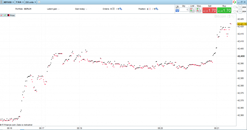
Source: IG
With the human brain being what it is, the natural next step is to establish patterns in the activity. If the Bitcoin example price appears to be heading upwards – price action is bullish. The below chart shows the Tick Data of the same market just a few minutes later, and the mood has turned; and by just noting the price points, it can be seen that price action is now bearish.
Bitcoin$ – Tick Data price chart – Bearish Price Action
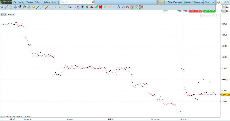
Source: IG
Price Action – Line & Candlestick Patterns
The next step is joining up the dots, and the principles remain the same regardless of the asset being monitored. In the below example, the AUDUSD market is considered over a slightly longer time frame of three hours with price recorded every minute. Setting the chart preferences to a line chart provides a clearer visual representation of the moves.
AUDUSD – 1m price chart – Line Chart
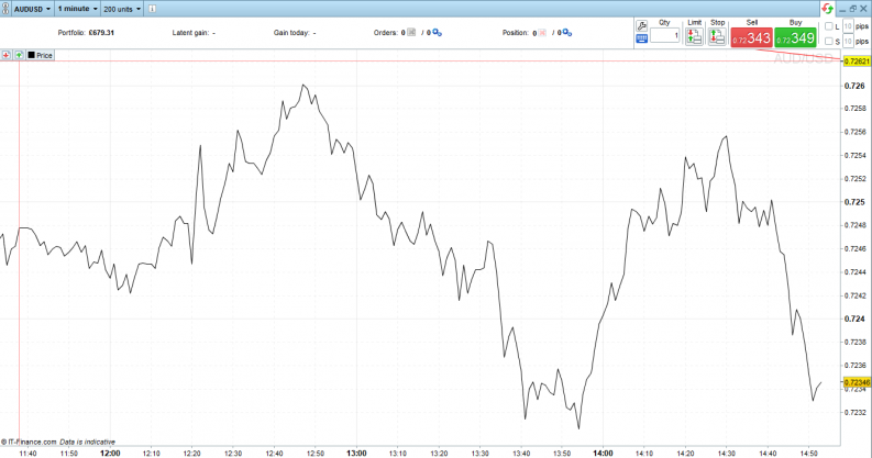
Source: IG
Price Action – Candlestick Dimensions
The below chart shows the AUDUSD market over the same period, but a candlestick marks each one-minute interval. Each of the candles in the candlestick chart shows where price opened at the start of that interval, closed at the end of it and the high and low price printed during that minute. The data used to generate this summary of trading during those 60 seconds is made up of each individual trade booked on the exchange.
AUDUSD – 1m price chart – Candlestick Chart
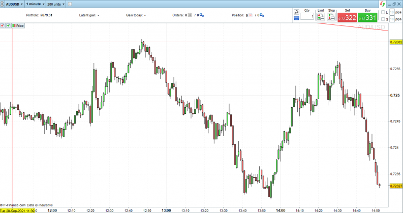
Source: IG
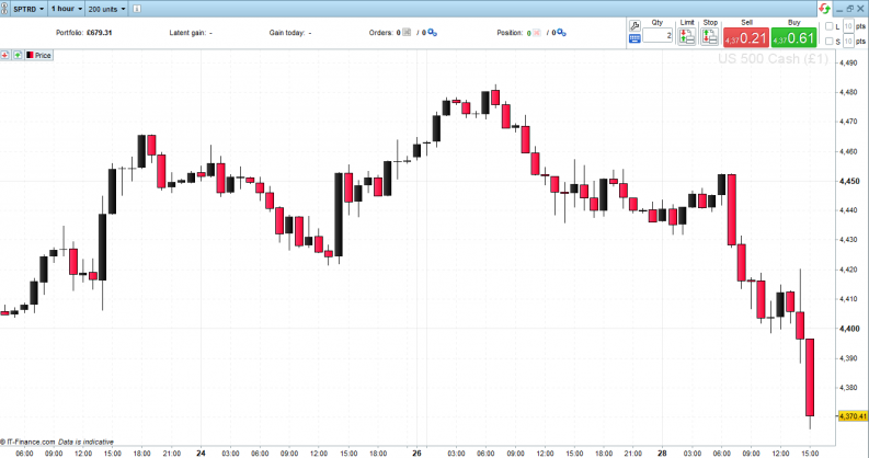
The below chart of the S&P 500 index is set to show candles on an hourly time frame. By zooming in to a shorter time frame, it’s possible to see the shape and dimensions of the candlesticks offers an insight into the market’s mood.
Red candles mark hours in the day where price closed lower than at the start of that hour. Black candles are bullish and represent upward moves in price over 60-minute intervals. The wicks of the candles show the extreme high and low price in each period.
S&P 500 Index 1 Hour Price Chart – Candlestick
Source: IG
Price Action – Bar Charts
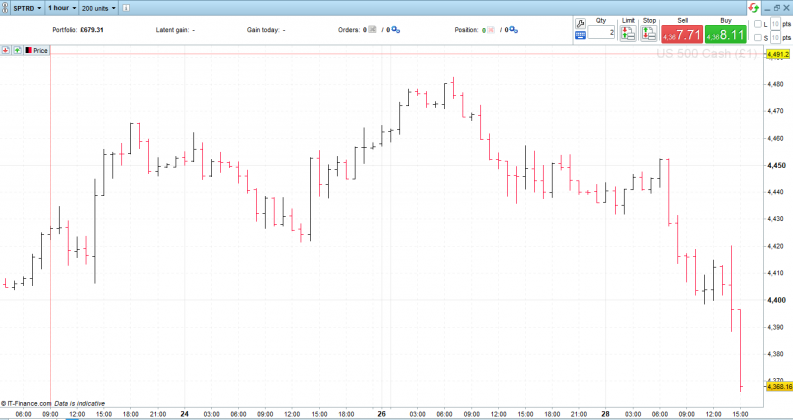
Another popular chart is a Bar Chart. The below being one of the S&P 500 index over the same time period of the candlestick chart.
S&P 500 Index 1 Hour Price Chart – Bar Chart
Source: IG
The above charts show price data in its purest form, and whether you’re using tick data, candlestick, bar, or line charts, it’s possible to get a feeling for the market from price data alone. They just record the price at which buyers and sellers exchange over a period. Simplicity is the selling point of price action analysis. In the case of tick data and line charts, it offers an uncluttered view of patterns. With bar charts and candlesticks, it’s possible to gauge market mood using the shape and size of the boxes and lines used to illustrate price events.
- Tick Data – a real-time record of price as and when it happens
- Line chart – shows price over time in its simplest form
- Candlestick Chart – shows price over time with each time interval represented by a candlestick. The top of the wick is the high, bottom of the wick is the low, and the body marks the opening and closing price. If the candle is red, then the closing price was lower than the opening price. If it is green/black, then the closing price was higher.
- Bar Chart – plots the open, high, low, and close of a trading period using horizontal and vertical lines
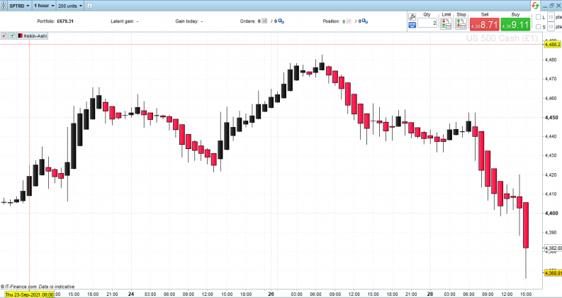
- Heiken Ashi – a second generation candlestick-based interpretation of price data. Rather than just displaying the high, low, open and closing price, Heiken Ashi charts apply a formula designed to help traders spot trends.
S&P 500 Index 1 Hour Price Chart – Heiken Ashi
Source: IG
As the below chart illustrates, more advanced strategies or even simple strategies that incorporate a broader range of confirmatory indicators can dazzle the eyes.
AUDUSD 1 Minute Price Chart with MACD – RSI – Oblique Trend Lines and Simple Moving Average & Bollinger Bands
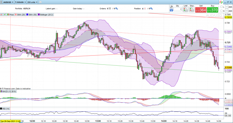
Source: IG
As long as you know the purpose of each indicator being applied, the general rule is to use as many of them as possible when making a trading decision. If they all simultaneously confirm a trade opportunity, then you’re starting from a stronger position. Price action is the most important metric, and while it can still be done using the above chart, there is a lot of other noise. Considering higher-level price action strategies helps take trading decisions back to core fundamentals.
Different Types of Price Action Trading Strategies
There are different ways to display price data. The various strategies used to trade it rely on two things: the patterns that form over time and the dimensions of candlesticks/bars in a particular interval. It’s possible to use pattern and shapes in conjunction or on their own.
The effectiveness of each approach is influenced by a wide range of factors, including the asset to which they are being applied and general market conditions which are constantly changing. To put it another way, what works today might not work tomorrow and vice versa. At this point, the best option is to run through some actual trade setups which use price action strategies.
Price Action Trading Strategies Using Chart Patterns – Case Study GBPUSD
The movement of price over time allows traders and investors to predict where it might be heading next. Some tools can help, as these case studies illustrate.
Using Price Action Patterns to Trade With a Trend
One of the critical elements of successful trading is trading with the trend, not against it. This can be a tough lesson for beginners to take on board as many approach trading with ‘things have got to change soon.’ Trying to get into trends too early and putting money to work on the back of false signals is also a pitfall to avoid.
The GBPUSD price rally through 2020 was on the back of the UK economy stabilising after the years of uncertainty surrounding Brexit. The British pound became more attractive to hold on the back of economic fundamentals. The low point for the currency pair came in March 2020 when it traded at 1.15, partly due to US dollar strength as investors flocked to the safe-haven currency during the peak of the COVID crash. By February 2021, GBPUSD was printing at 1.415, a gain of +23% in less than 12 months.
GBPUSD 1 Day Price Chart – Price Action Case Study – Price Action
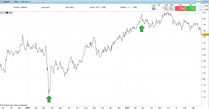
Source: IG
While the price action on the chart provides a ‘feel’ for the upward market move, applying trendlines clarifies the move. The bottom line of the channel of the upwards trend also forms a support line.
GBPUSD 1 Day Price Chart – Price Action Case Study – Trend Lines
Source: IG
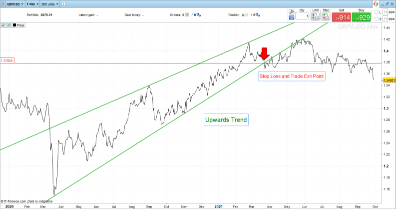
Using Price Action Patterns to Exit Trades & Set Stop Losses
Running with the price action trend, which started in March 2020, would have been a profitable trade. Selling at the peak in February would have optimised returns but gone against the principle of running winners. Closing out a winning position just because it’s high could have happened at many points in the preceding months and meant the trader left some money on the table. A trailing stop loss set just below the supporting trend line would have helped manage the trade and, in this case, would have triggered a trade exit signal at 1.3785, which still represents a substantial return of 20.13%.
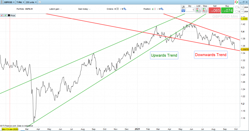
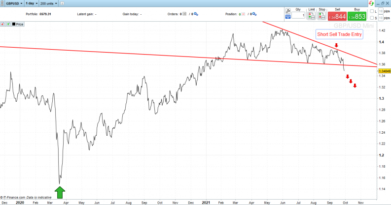
Another layer of complexity is added by the fact that a market may be trending in one direction on a short term basis but in the opposite direction on another timeframe. In the example of GBPUSD below, sterling is showing strength on a long term basis but currently trending downwards in a retracement pattern.
GBPUSD 1 Day Price Chart – Price Action Case Study – Trend Reversal
Source: IG
The gradient of the two price action trends suggests the first bull run had more momentum than the current downward trend pattern. That’s a good sign for trend-followers as stronger momentum leads to longer running price action trends.
There are still opportunities to sell short the current downwards trend. Using price action, trade entry points where price touches the top end of the downward trend line would have been good entry points. That upper line forms a resistance level to upward price movement, and trailing stop losses set above it would minimise losses if (and when) the momentum in the market returns to support upwards price action.
GBPUSD 1 Day Price Chart – Price Action Case Study – Breakout
Source: IG
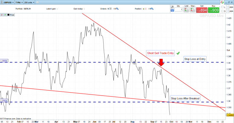
The above chart illustrates how price has broken through the supporting trendline. Following the principles of a breakout strategy allows the stop loss to be moved from just above the trade entry point to just above the supporting trend line. That locks in some profits if price reverses and moves upwards.
Short Sell in GBPUSD
- Entry Price – 1.3851
- Stop Loss at Trade Open – 1.3905
- Stop Loss after Breakout to the Downside – 1.3591
The below chart zooms into the current market situation to show how stop losses have been adjusted. This is now a guaranteed winning trade but can be left to run and capitalise on further downward price action.
GBPUSD 1 Day Price Chart – Price Action Case Study – Stop Loss Levels
Source: IG
KEY POINTS FOR TRADING PRICE ACTION STRATEGIES USING CHART PATTERNS
- Identify the trend direction and trade with it
- The length and gradient of the trend provides insight into the degree of momentum
- Run winners but use trailing stop losses and support/resistance lines to identify trade exit points
- Know your market – Some assets have a natural bias to trend in a particular direction. Equities markets, for example, are characterised by long steady upwards trends interspersed with severe but short pullbacks. Other markets such as forex tend to have a less natural bias.
- Don’t be afraid to move stop losses, but only ever towards price (to lock in gains) and not away from it (risking further losses)
- When price breaks out of a price action pattern, it can signify the start of a new trend where knowledge of breakout strategies would be useful
Other Strategies and Signals to Use With Price Action
Other indicators may prove helpful tools and incorporating them can help test how strong a trade signal is. Many of them still use price, just in different ways but keeping a clear understanding of price action trends is a core fundamental. Strategies and indicators which could be used in conjunction with price action include:
Price Action Trading Strategies Using Candlesticks – Case Study Nasdaq 100 index
Candlestick and bar charts that display price action data over particular periods also provide an insight into market direction.
Taking the Nasdaq 100 index as a case study offers an opportunity to analyse how candlesticks can provide trading signals in the ever-popular basket of big tech stocks.
Using Price Action Candlesticks to Trade With a Trend
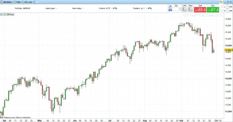
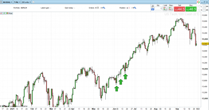
Starting with a clean price chart showing only price action and daily candlesticks, it’s possible to establish that on a daily timescale, the Nasdaq 100 has been moving upwards since April 2021.
Nasdaq 100 index 1 Day Price Chart – Price Action Case Study – Candlestick Patterns
Source: IG
The array of green candles details a long sequence of ‘up days’ interspersed with red candles marking days when the index’s closing price was lower than the opening price. Equity markets tend to sell off harder than they climb, so the red candles are larger, reflecting the price moved more severely on down days.
The wicks of the candles and the tails above and below the candlestick’s body also provide clues to trend direction.
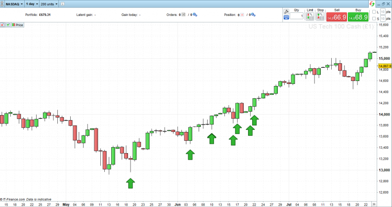
Zooming into the time period May to July, which marked the start of the multi-moth bull run, many of the daily candles have long lower wicks. This shows that price on that day traded at lower levels, but buying pressure had driven price upwards by the close of the day’s trading. A groundswell of buying pressure is something that investors look out for when deciding to put on a long position.
Nasdaq 100 index 1 Day Price Chart – Price Action Case Study – Candlestick Patterns
Source: IG
At the same time, the upper wicks of most of the candles are shorter or even non-existent. Where there aren’t any upper side wicks, the candlestick is explaining that price rallied hard into the close to end the day’s session on a high: another bullish factor and a reason to stay in the long position.
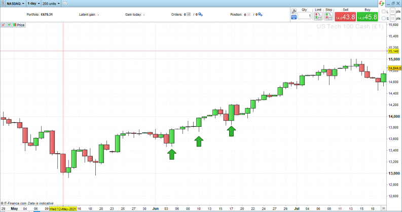
The three candles pinpointed in the below chart are all green and have long lower wicks and short upper wicks. These bullish candles reflect the dates 4th, 10th and the 17th of June. Entering into long positions on any of those days and holding the position until the 6th of September would have resulted in a minimum return of 10.56% in less than three months.
Day Price Chart – Price Action Case Study – Candlestick Dimensions
Source: IG
Nasdaq 100 index 1 Day Price Chart – Price Action Case Study – Candlestick Dimensions
Source: IG
Using Price Action Patterns to Exit Trades
The big red candles, which represent a bull market reversal, signify that it could be time to exit long positions. However, other price action candles give a clue to a reversal forming before it happens.
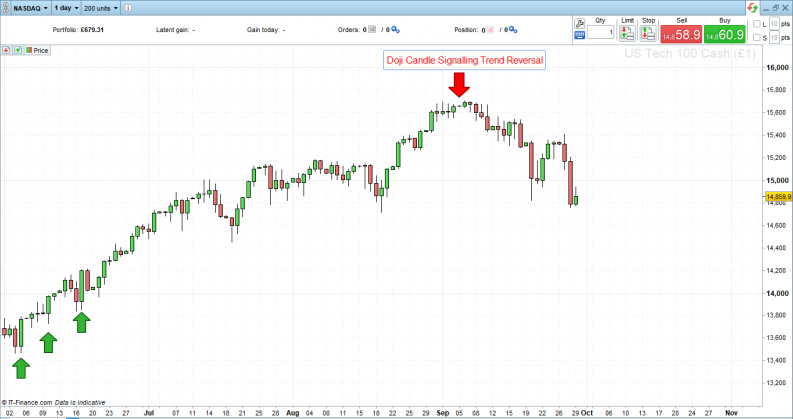
- Doji candles- A doji candlestick pattern marks a session in which the candlestick for a security has an open and close that are virtually equal. Doji candlesticks look like a cross, inverted cross or plus sign and the greater the length of the wicks, the greater the lack of direction in the market during that period.
Doji candles give off better signals when used in context with the candles that precede and follow them, but the Nasdaq 100 case study shows how one candle alone can be incredibly powerful. On the 5th of September, just two days before the market rolling over, one doji candle signals the end of a 21.56% four-month bull run and the start of a 5.83% correction in the world’s flagship stock index. Not bad for a few lines on a chart. Price action candlestick indicators may appear simple in nature, but that is also their strength.
Nasdaq 100 index 1 Day Price Chart – Price Action Case Study – Doji Trend Reversal
Source: IG
Other Price Action Candlestick Strategies to Trade
Trading using price action candlesticks forms a whole subsection of Technical Analysis, and some investors make their trading decisions using them and nothing else. Price is the ultimate market data point, and candlesticks offer a neat way of interpreting what is going on at the heart of the market.
Other Candlestick strategies to consider include:
- Bearish Engulfing
- Bullish Engulfing
- Hammer
- Inverted Hammer
- Tombstone
- Shooting Star
- Hanging Man
- Three Black Crows
- Three White Soldiers
To learn more about different candlestick patterns, visit this trading guide or open a demo account with a reputable broker to develop your skills using virtual funds.
Candlestick patterns can be applied to any time frame. Day traders in equities can use the opening candles of a trading session to predict market moves through the rest of the day. Buy and hold investors can use daily candles to spot an optimal entry point on a trade, mainly based on fundamental analysis. The potential is endless, and the signals are powerful thanks to candlestick price action being a visual representation of the core metric of the markets, price – which explains why they work.
ADVANTAGES OF USING PRICE ACTION TRADING STRATEGIES
- Price Action highs are strong indicators because they analysis the most important element in any market, price.
- Price Action indicators are market neutral, so they can be as reliable signalling a downturn in price as an upward price move.
- They have been used for years and are a well-known signal, which means many traders use them, and this can be self-fulfilling in terms of their effectiveness.
- Price action strategies can be applied to any type of asset market and any timeframe.
- Trading in the same direction at the market trend is a key to making a positive return. Price action strategies incorporating support and resistance levels and other trend-following tools can help traders spot trend-based trade entry and exit points.
- Discipline is a crucial element of successful trading. The clear trade entry and exit points associated with price action strategies help novice traders get past the temptation to enter into or out of trades too early.
- The strategy is easy to understand, and brokers provide all the tools which might be needed to apply it.
DISADVANTAGES OF USING PRICE ACTION TRADING STRATEGIES
- Price action strategies are a lagging indicator – they explain where price has been. That data in its raw form is powerful, but other indicators that take it and modify it can better guide where price might move next.
- Candlestick patterns offer guidance on stop loss placement at the start of a trend but don’t offer much guidance on where to set trailing stop losses once the trend has formed.
- While technical analysis is at the heart of the strategy, fundamentalfactors also need to be considered. If a price move is due to a sudden shock event impacting the market, the existing price action strategy is likely to break down.
- There is a range of common problems which explain why technical indicators fail.
The Bottom Line
Trading using price action works on simple principles, but the techniques involved can be easy to learn but hard to master. This is largely down to price action being a lagging indicator. Being aware of the limitations is essential, but price action is so crucial that monitoring it is essential for all traders, in all markets, over all time frames. It takes traders to the heart of the market.
Applying other indicators can help but using price action as the foundation of trading decisions is never a bad idea.
Further Reading
- Develop the skills required to be successful using price action trading by visiting this educational area of the AskTraders site.
- More detail on how to trade the opening range using price action chart patterns can be found here.
- Active traders who want to run one-minute scalping strategies using price action can learn more about that here.
- Trading with the trend is the secret to successful investing, and ways to use price action to understand trends are outlined here.